The 10 | Kerri N


Friday, February 29, 2008

Illustrator: Shapes 101


This is a very simple thing to make in Illustrator and should definitely help you guys get your feet wet if you are a novice and Illustrator is still intimidating to you. During this tutorial you will deal with shapes: how to make them, lock them, and merge them. Let's get right to it, shall we?


Make the shapes. On the left of the screen you will see the toolbox containing your selection tools, type tools, and pretty much everything else. Click and hold down on the rounded rectangle tool. The menu will expand giving you more shape options. Select the ellipse (circle) tool and make a circle on your artboard about 100 x 100 pixels in size.


Select the hexigon tool and click the artboard. A window will pop up giving you the option to specify sides. Choose 3 sides and click OK. Shrink and stretch it accordingly and drag it down to the bottom left corner of the circle. Alt click and drag the triangle to make fangs. Repeat this by making and duplicating a rectangle half the size of the fangs and drag them to make front teeth. Use the ellipse tool for the eyes and set the fill to black, along with the stroke.


Lock the shapes. Select an eye and go to object/lock/selection to disable selection, and repeat with the other eye. Unfortunately, once you lock a bunch of stuff you can't unlock one without unlocking them all, but grouping your objects will help keep them sorted for you. To group objects select them and go to object/group. You can ungroup them at any time.


Merge the shapes. Click and drag across your artboard to select all unlocked objects, which includes the teeth and circle. Go to window/pathfinder and select "Add to shape area", which is a button top-left in the window. With this new multi-shape selected, click the color palette in your tool box and the color window will pop up. At the bottom right of the color window there is a hexidecimal field (six digits) thatlet's you input a color code to specify a very specific color. You will be entering F7F2DA into this field. Click OK.


Well there you have it: your very own cartoony vampire skull. My next installment would probably be on stylizing and texturing to create a truly horrific little vamp skull. Keep your eyes peeled, because you'll be seeing this little bugger again.

Labels: ,

Friday, February 15, 2008

UPDATE: Changes in The Art Blog

First off, how ya doin'? Nobody seems to ask that anymore. Now let's get to business. I've been given an offer by my teacher that I cannot refuse. I will be releasing a weekly or bi-weekly newsletter filled with resources, reviews and other designy goodness for the benefit of the other art students, and I'll be posting the newsletter here on The Art Blog. Yes, there will still be everything else, but there will also be newsletters. You guys can certainly benefit from them too, so what have you got to lose?


Also the header image will be changing very soon, I'm starting to feel a sense of blandness toward this design after I finished a few designs for my other blogs. I may link to them in the future, but right now I'm still going by the whole "never mix business with pleasure" philosophy. So basically be lookin' out.

Labels:

Wednesday, February 13, 2008

Photobucket be damned!

I know I've been slacking on the blog lately but readers you must realize - I'm a student and laziness is part of the job. At any rate, I've found a few useful and all around freakin' sweet resources that I'd like to present to you guys. Always remember: Unless stated otherwise, all of the recourses I present are free because I'm broke and according to economical statistics so are you. Without further filler text here we go:


CARBONMADE


Carbonmade is the ultimate in free online art portfolios. The portfolios themselves are ad-free and very well stylized, so you're well presented until you can get your own web site. The only reason why I say it's a good temporary solution as opposed to a permanent one is because there are limitations in regards to how much you can present. As a free user you can have up to 5 categories with 35 images hosted, but if you're a newbie designer that should be more than enough. They also have a Whoo! (I love that) account you can upgrade to that gives you a whole lot more. For those just skimming the place here's the general deal:


    FREE
  • Cool display options

  • Five categories

  • Up to 35 images in those categories

  • Your portfolio is ad-free


    WHOO!
  • It's 12 bucks a month

  • You can have up to 50 categories

  • Up to 500 high-resolution images

  • 10 high quality videos

  • Your portfolio is of course ad-free


FILE DEN


File Den is presently the coolest thing sense canned bread (wait....) in my arsenal of artsy weapons because not only is it completely free but you can also store damn near any file type known to man. The ads are minimal, the site is simple, and the navigation won't make you want to kill a guy quite as much. Let's go over a few things:


  • It's FREE

  • It's easy to use

  • Hotlinking is encouraged

  • 1GB storage space

  • 50MG file size limit

  • 5GB monthly bandwidth


ACE PROJECT


Alright I admit it: the navigation of Ace Project made me want to chunk my precious laptop into the woods. Not because Ace Project sucks and I want it to die, but because there are waaay too many options to select when organizing a project on this site. Ace Project is a web-based project management program that helps aid in the prevention of flaking out on your occupational responsibilities as a designer. The system is actually pretty innovative but when it comes down to it, I think It's mainly used by accountants and other people with a whole lotta tedious stuff going on. Why do I recommend it? Well, because I use it myself and find it to be highly productive in the hands of your average ADD artist (and there are a lot of us). Besides, there is a check box when creating a project that grants you the service of filling in the default options for you. Here are a few of the many specifics:


  • Multiple project management

  • Task reminders

  • Multi-user

  • Job assignment

  • and other stuff like that


FORUMER


For those of us who couldn't give two shits (yes, I speak French) about a domain name and just want a freakin' forum for...I dunno...things of a forumy nature, there is Forumer. Forumer is free just like everything else, only there will be Google ads on your forum unless you're willing to toss them two bucks a month for the removal of said ads. Also, you can only have one forum, unless you do what I do and create like twenty accounts. Look it:


  • phpBB2: Choosing this type of forum will limit you in terms of customization, but they and I alike recommend creating a phpBB forum if you are unfamiliar with the anatomy and design of this sort of thing.

  • IPB: This is the forum type I chose to use for a few reasons; the main one being so I could customize to little black heart's content. This is not recommended for those unfamiliar with html, css and other codes of that nature.


Well there you have it. I hope you can find these sites and services useful in some way, both normal and to declare your love for your goat/girlfriend. Hey, I don't judge...

Labels: , ,

Tuesday, January 29, 2008

The Scribbler

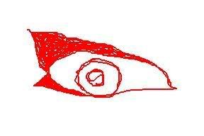
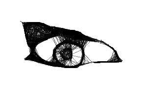
Stumbleupon does it again! I found this awesome little online doodad while surfing the net and picking my nose. It's pretty basic. You doodle an image and it redraws it for you Etch-A-Sketch style, and the results are typically fantastic. This would be great if you have a Wacom Tablet, and if ya don't (which I obviously don't) it's still fun to play with.


Here is my doodle


This was the Doodler's Response


If you have a lot of gaps in your drawing be careful, or you'll end up with a lot of stray lines. Remember this is Etch-A-Sketch style; there will be linage.


Doodle With Gaps


I've seen a lot of sites with applications that do this sort of thing, but each one is a bit different and offers different behaviors and ultimately different results. Click
here to go to the Scribbler.

Labels: ,

Thursday, January 10, 2008

Retro Mabacre

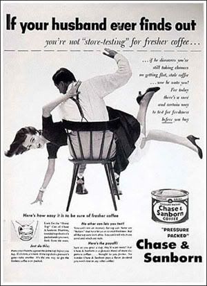
As is often the case, I got incredibly bored and my old man directed me to Digg for momentary entertainment and I saw these creepy ads from times past. I think at this point that material of this nature should be called 'retro macabre', considering that our grandparents were clearly hardcore.


You filthy whore.


First up we have this little coffee ad. Nothing sells coffee like tapping into the wife-beating demographic.


Victory Bonds


Who knew Nazis had such bony fingers.


Uh...


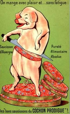
The worst part is, this made your granny want some pork chops.


The generation responsible for and that responded to this kind of advertising is currently being stored in various incompetent old people prisons (i.e. nursing homes). I see a serious bed-pan-throwing retaliation in our near future. These people don't fuck around. The complete list of 'Ten Creepiest Old Ads' can be found here.

Labels:

Monday, December 31, 2007

The Rosetta Stone

For those of you who don't know what the Rosetta Stone is, it's a big freakin' rock etched around 196 B.C.E. and found by some French guy in the 1700s. Basically, it's a stone with three different types of hieroglyphs chiseled into it, one translating the other before it.


Why am I schooling you guys? Well because, I found a kickass rub of it somewhere in the abyss that is the internet. Trust me guys this is a deal; it's the best look you can get of it without pressing your face against museum glass. Check it out here.

Labels:

Friday, December 21, 2007

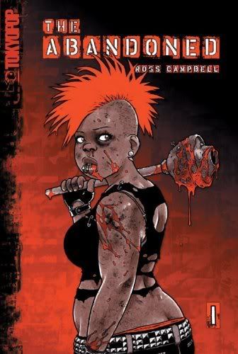
BOOK: The Abandoned

I've actually had this graphic novel for a while but for some reason it took me...oh I dunno...a year to decide to write about it. That's a year's worth of ADD folks. Anyway here it is:


The abandoned


Here's the jist: Somewhere near Savannah, Georgia there's some kids working in a creepy ice cream shop (mind you everything about Georgia is a little creepy, I know I share a state line with those guys) when a hurricane blows through and suddenly all the town folk are all kinds of zombie-fied. Don't know why. When it comes to Tokyo Pop it's usually best not to ask questions. Either way, the art is kickass, the gore is satisfactory, and the characters look like real people as opposed to tweaked-out big-eyed 90 pound sticks with tits. Yay zombies.

Labels:

Wednesday, December 19, 2007

WHAT'S UP: Micro Buttons

Ever wondered what the hell kinda font people have been using for those tiny 'link to' buttons? Well, out of absolute boredom I figured it out. All hail the almighty Google blah blah blah.


These tinies are called 'micro buttons'. Though they are not for the visually inept they do provide a good bit of linky information in a stylish manner and they take away very little of the site's design. Hell often times they add to the site's design. Here are the specs for making your own:


  • The standard micro button size is 80x15.

  • The universal font used for them is Silkscreen by Jason Kottke.

  • Most of the time these buttons have a small white cut to the left to display initials or whatever, but they come in all styles.


Happy button making and remember: Uncut Columbian is only uncut if you're in Columbia.

Labels: ,

Tuesday, December 18, 2007

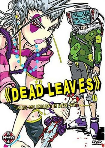
Movie: Dead Leaves

So I was flipping channels the other night and the Sci-fi Channel was running Blood: The Last Vampire. Whatever. I've seen enough emo vamp paraphernalia in my day. I flip back about 30 minutes later and I was slapped in the face by this:


Dead Leaves. I never cought why it was called that because i was too busy being captivated/stunned and holding my sides from the laughter. I've seen a lot of weird movies in my day but this one takes the cake. I couldn't look away. The whole thing has something to do with the two main characters, Pandy and Retro, breaking out of a prison on the moon. And you know I couldn't help but notice that the guy with the T.V. on his head (Retro) was really friggin' hot. I don't even have to ask if there's something wrong with me.

WATCH IT!!

Labels:

HTML: Crash Course

This post is all about tags. I'm sure a lot of you are damn tired of having 'Hosted by Photobucket' appear at the bottom of every picture you link to, so I'm gonna tell you how to bypass the sickening commercialism attached to all of your hosted photos. Your dead dog shouldn't be hosted by Photobucket.


Copy the direct link url located below your image on the Photobucket website. Navigate to the place where you want to place your image and follow these steps:


Insert this short code and paste the url you copied in place of (url):

<img src=" (url) ">


When you're done, you should have something like this:

<img src="http://www.photobucket.com/image.jpg">


Same goes with linking text instead of just slapping a long ugly link down. This is what you write:

<a href="http://www.google.com">This is a link.</a>


This is what you get: This is a link.


For a while you'll have to reference the code and c/p it, but eventually you'll memorize it and be able to toss those brackets around like hotcakes. Practice is key to mastery, grasshopper.

Labels: